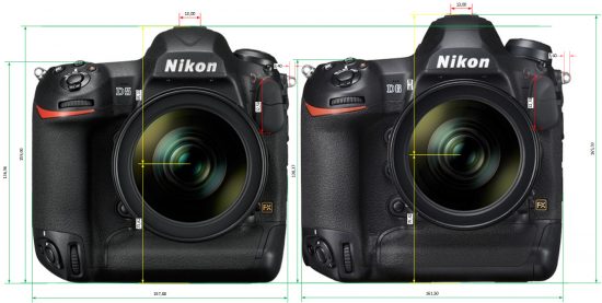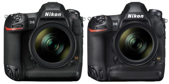
Nikon D5 vs. Nikon D6 comparison


Here is the first quick Nikon D5 vs. Nikon D6 comparison based on the D6 press photo:

  • Prism is a different shape and taller (built-in Wi-Fi, GPS?)
  • The mode button is taller (more functionality added?)
  • Slight angle difference to buttons plate (ergonomics?)
  • Camera’s grip is angled and bigger at the bottom (ergonomics?)
  • Slight angle and size difference to side grip buttons (ergonomics?)
  • A small bump in the lower-left corner (just a bad photoshop?)
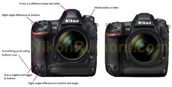


Do you see any other differences?


Like the new Nikon D6 Facebook page
This entry was posted in Nikon D5, Nikon D6. Bookmark the permalink. Trackbacks are closed, but you can post a comment.
  • FCC disclosure statement: this post may contain affiliate links or promotions that do not cost readers anything but help keep this website alive. As an Amazon Associate, I earn from qualifying purchases. When you click on links to various merchants on this site and make a purchase, this can result in this site earning a commission. Affiliate programs and affiliations include, but are not limited to, the eBay Partner Network. Thanks for your support!

  • Back to top